Transforming Search into Discovery

Transforming Search into Discovery

Transforming search into Disocvery

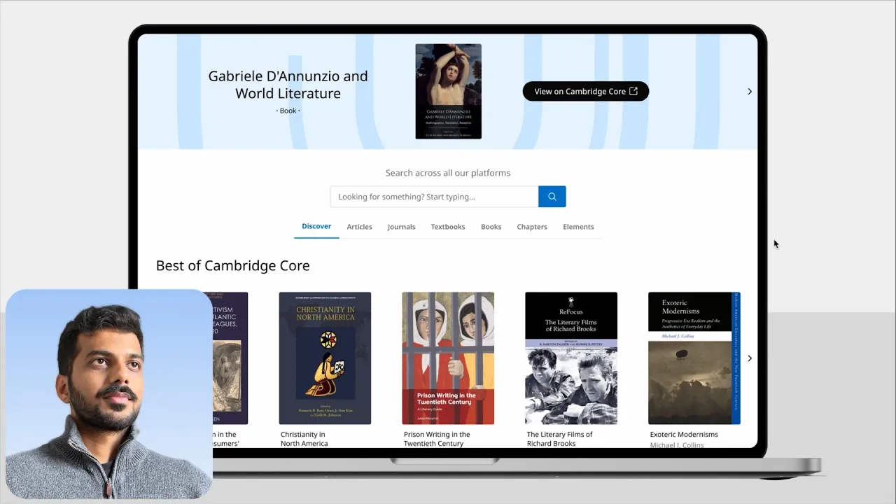
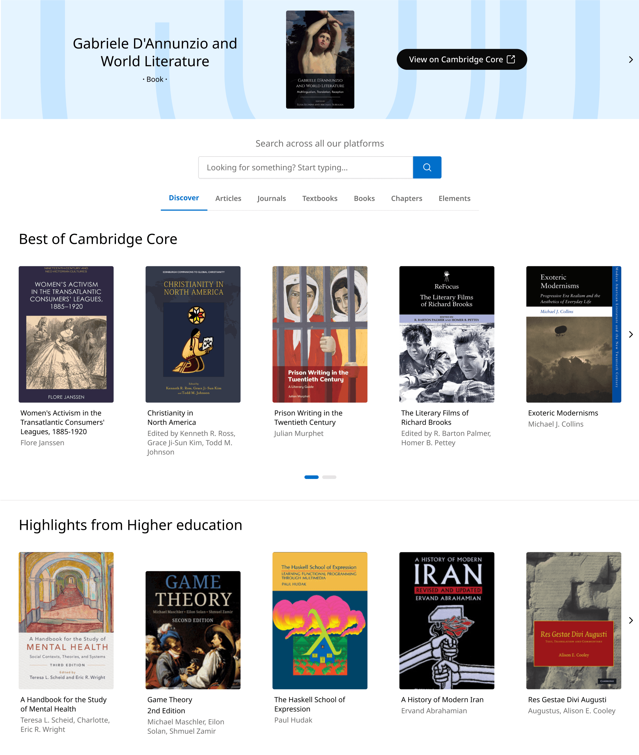
Project brief: The Discovery Tool is the central hub for Cambridge University Press academic content. The goal was to transform a static search like page into an immersive discovery experience, showcasing the full portfolio to drive exploration beyond the search bar.

Role: Lead Designer (Strategy & Ui)

Team: 3 product owners + Head of Ux

Focus: Product strategy, Prototyping, Stakeholder management

Status: High-fidelity prototype validated with 18 users at Digital Day. Championed by senior stakeholders for product roadmap.

What wasn't working

What wasn't working

What wasn't working

1

2

3

4

5

1

2

3

4

5

1

2

3

4

5

Heuristic evaluation of the current page

1

Anchoring bias: Users tend to focus on the first thing they see. Since they’re greeted with a search bar, they end up treating the page like a search listing page.

2

Signifiers: Elements should clearly indicate their function. Right now, it's unclear which filters are selected and which aren't.

3

Hicks law: Too many options make decisions harder. Right now, results show all content types at once, which can be overwhelming.

4

Cognitive load: Users absorb visuals faster than text, so lack of images on the screen leads to more cognitive effort.

5

Visual hierarchy: People naturally follow a visual hierarchy when processing information. Right now, there's no clear order, leaving users unsure about what to read first.

Looking at the data

Looking at the data

Looking at the data

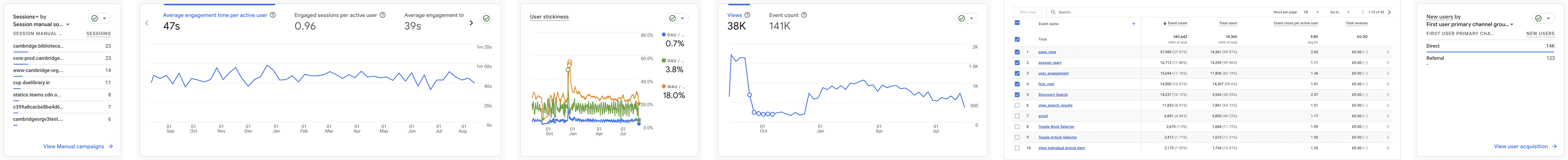
Header navigation insights:

Over 70% click the “Discover” button without running any search, indicating strong curiosity but low follow-through on deeper exploration.

A strong baseline

of intent:

A strong baseline of intent:

A strong baseline of intent:

39.7% proceed from the Discovery Tool to view full content, showing that those who engage are motivated and purposeful.

Search tool

under-utilised:

Search tool under-utilised:

Search tool under-utilised:

Fewer than 40% run a Discovery Search, suggesting most visitors rely on default content rather than active querying.

Engagement gap:

Scroll and filter use remains low, reinforcing that the page functions more like a static landing page than a true exploratory tool.

To turn discoverers into searchers,

we set 3 key UX objectives

01:

01:

Improve discoverability

Improve discoverability

Highlight individual content types

Highlight individual content types

Highlight individual content types

02:

02:

Reduce the effort

Reduce the effort

Make it easier to find content types

Make it easier to find content types

Make it easier to find content types

03:

03:

Generate curiosity gap

Generate curiosity gap

Users actively seek missing information

Users actively seek missing information

Users actively seek missing information

Subash

Subash

Subash

Product owner

Product owner

Product owner

Head of UX

Head of UX

Head of UX

Product owner

Product owner

Product owner

Design philosophies we followed

Explore only one content type at a time. This helps users focus on what Cambridge offers in a clear and focused way.

Explore only one content type at a time. This helps users focus on what Cambridge offers in a clear and focused way.

Explore only one content type at a time. This helps users focus on what Cambridge offers in a clear and focused way.

A book cannot look like an article. We were working with 7 different content types, so we decided to separate content types with unique layouts.

A book cannot look like an article. We were working with 7 different content types, so we decided to separate content types with unique layouts.

A book cannot look like an article. We were working with 7 different content types, so we decided to separate content types with unique layouts.

Let the content dictate the layout. Not the other way around (form follows function).

Let the content dictate the layout. Not the other way around (form follows function).

Let the content dictate the layout. Not the other way around (form follows function).

Product owner

Product owner

Product owner

Head of UX

Head of UX

Subash

Subash

Subash

Product owner

Product owner

Product owner

Rethinking first point of contact

Following the Ux strategies and philosophies we re-designed the header navigation; the first point of contact for users to get into the discovery tool.

Global header

Discover content

Search

Articles, Journals, Books, Textbooks, Courseware, Elements, Chapters

Discover content

Global header

Discover content

Articles, Journals, Books, Textbooks, Courseware, Elements, Chapters

Discover all content

Before

After

Global header

Discover content

Search

Articles, Journals, Books, Textbooks, Courseware, Elements, Chapters

Discover content

Global header

Discover content

Articles, Journals, Books, Textbooks, Courseware, Elements, Chapters

Discover all content

Before

After

Global header

Discover content

Search

Articles, Journals, Books, Textbooks, Courseware, Elements, Chapters

Discover content

Global header

Discover content

Articles, Journals, Books, Textbooks, Courseware, Elements, Chapters

Discover all content

Before

After

Key Improvements:

  1. Removed the dominant search bar to shift focus away from search-first behaviour.

  1. Introduced direct links to content types, making it easier to jump into specific areas.

  1. Simplified the user flow by reducing layers between navigation and content access.

Wireframe

Wireframe

Key Improvements:

  1. Introduced all new “Discover” tab, which highlights the best content across CUP platforms.

  1. Added clear, horizontal tabs to help users focus on one content type at a time and reduce cognitive overload.

  1. Removed the overwhelming text heavy format

Possible downsides

Key Improvements:

Users might ignore the top banner if they see it too often; a common habit known as banner blindness. Still, we kept it because it helps promote platforms under CUP.

  1. Introduced all new “Discover” tab, which highlights the best content across CUP platforms.

  2. Added clear, horizontal tabs to help users focus on one content type at a time and reduce cognitive overload.

  3. Removed the overwhelming text heavy format

Possible downsides

Users might ignore the top banner if they see it too often; a common habit known as banner blindness. Still, we kept it because it helps promote platforms under CUP.

Key Improvements:

  1. Introduced all new “Discover” tab, which highlights the best content across CUP platforms.

  1. Added clear, horizontal tabs to help users focus on one content type at a time and reduce cognitive overload.

  1. Removed the overwhelming text heavy format

Wireframe

Ui designs

Ui designs

Ui designs

Before

After

"Book/Textbooks" view

"Article" view

"Chapters" view

Before

After

"Book/Textbooks" view

"Article" view

"Chapters" view

Before

After

"Book/Textbooks" view

"Article" view

"Chapters" view

Validation testing results:

To validate the redesigns, I utilized the annual Digital Day event to conduct guerrilla testing with 18 attendees. Participants were asked to locate specific content using the new prototype.

94% success rate
17 out of 18 participants successfully found niche content without using the search bar.

94% success rate
17 out of 18 participants successfully found niche content without using the search bar.

94% success rate
17 out of 18 participants successfully found niche content without using the search bar.

100% preference
All participants preferred the new layout over the text heavy format. “feels like I am browsing through Netflix” - participant

100% preference
All participants preferred the new layout over the text heavy format. “feels like I am browsing through Netflix” - participant

100% preference
All participants preferred the new layout over the text heavy format. “feels like I am browsing through Netflix” - participant

50% fewer clicks
The new navigation allowed users to reach content in half the steps compared to the previous version.

50% fewer clicks
The new navigation allowed users to reach content in half the steps compared to the previous version.

50% fewer clicks
The new navigation allowed users to reach content in half the steps compared to the previous version.

Key takeaway:

The prototype proved that users are willing to explore content when provided with visual entry points, validating the business case for a "Discovery-first" strategy.

Retrospective

Building a high-fidelity prototype and Guerrilla testing it quickly at Digital Day turned that insight into something tangible, which made it much easier to get stakeholder alignment.

The hardest part wasn’t the UI, it was shifting a “search-first” mindset. Using real data to show how people actually interacted with the page helped move the conversation from “I like the search bar” to “this is what our users need”

Project Impact

I delivered a detailed design system and documentation for the engineering team, defining component logic and edge cases upfront for the dev team.

This project became a blueprint for the wider platform. The Core search page adopted the tabbed navigation, and the product cards are now used on static pages. It helped move the business away from text-heavy lists and into a 'discovery-first' mindset.

Discover

Define

Ideate

Design

Test

Handoff

• Heuristic evaluation

• Data insights

• Heuristic

evaluation

• Data insights

• Ux strategy

• Design philosophies

• Ux strategy

• Design

philosophies

• Information architecture

• Wireframes

• Information

architecture

• Wireframes

• Ui designs

• Prototypes

• User testing

• A/B testing

• Design system

• Documentation