Reimagining HSBC through the lens of Dieter Rams
Redesigning HSBC through the lens of
Dieter Rams
Most of us in the UK divide our financial lives between two worlds. We trust traditional banks like HSBC and Barclays with our salaries, mortgages, and investments, but turn to fintech apps like Revolut and Monzo for everyday spending and tracking. The reason for this split is simple: fintech apps offer convenience and better UX that legacy banks struggle to match. This creates a strange disconnect where the apps holding our most important assets are actually the hardest to use.
As a designer, I believe good design is the perfect antidote to clutter and the the key to making a product genuinely useful. That is why I turned to Dieter Rams’ philosophy of “less but better” to bridge the gap between legacy and fintech apps.
In this project, I applied each of Rams’ “10 Principles for Good Design” to a real problem within the HSBC app. Each principle highlights a specific pain point, how I approached it, and the concept I designed to simplify that user journey.

01:
01: Good design is Innovative
01: Good design is Innovative
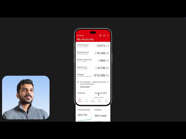
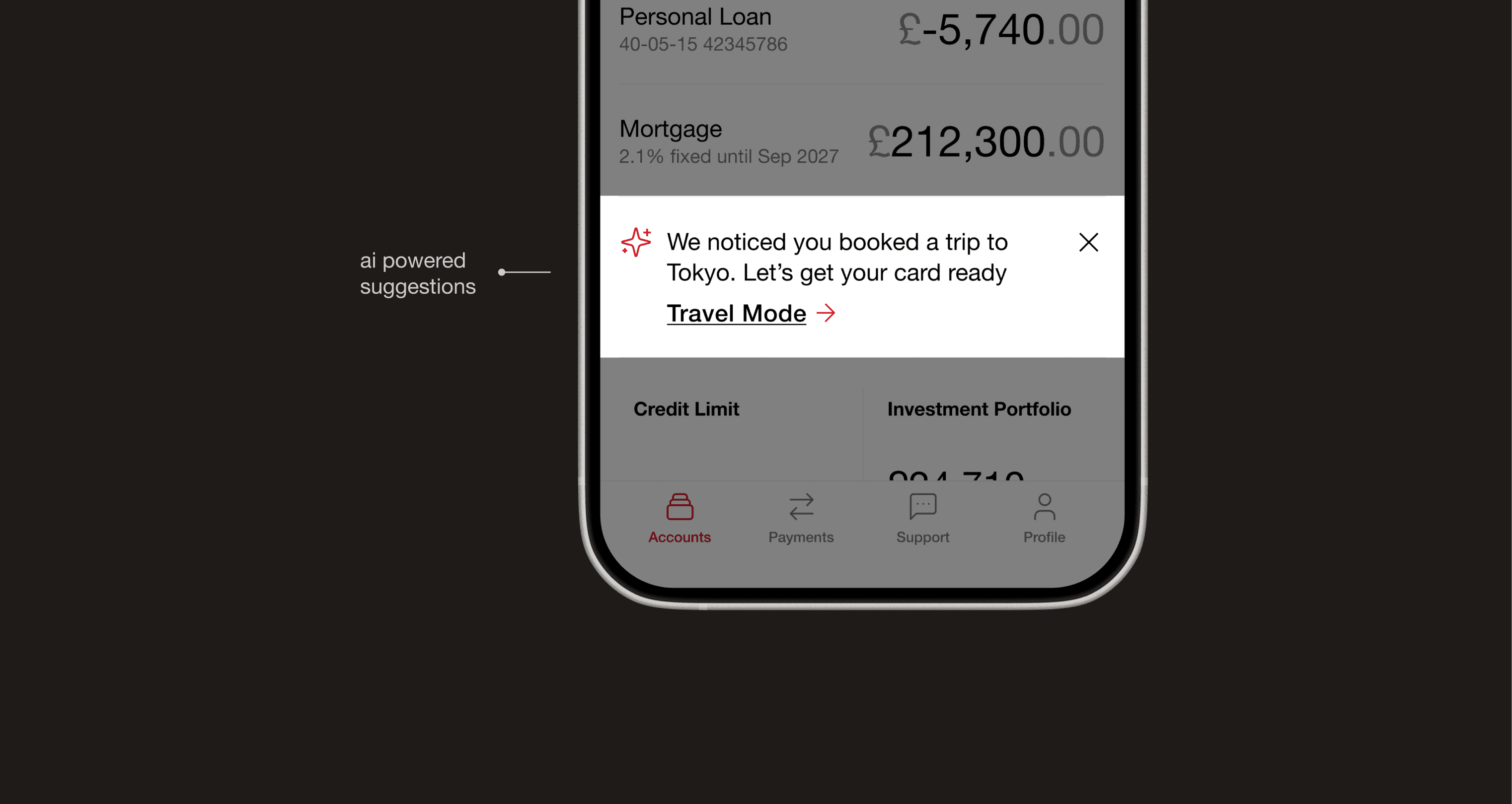
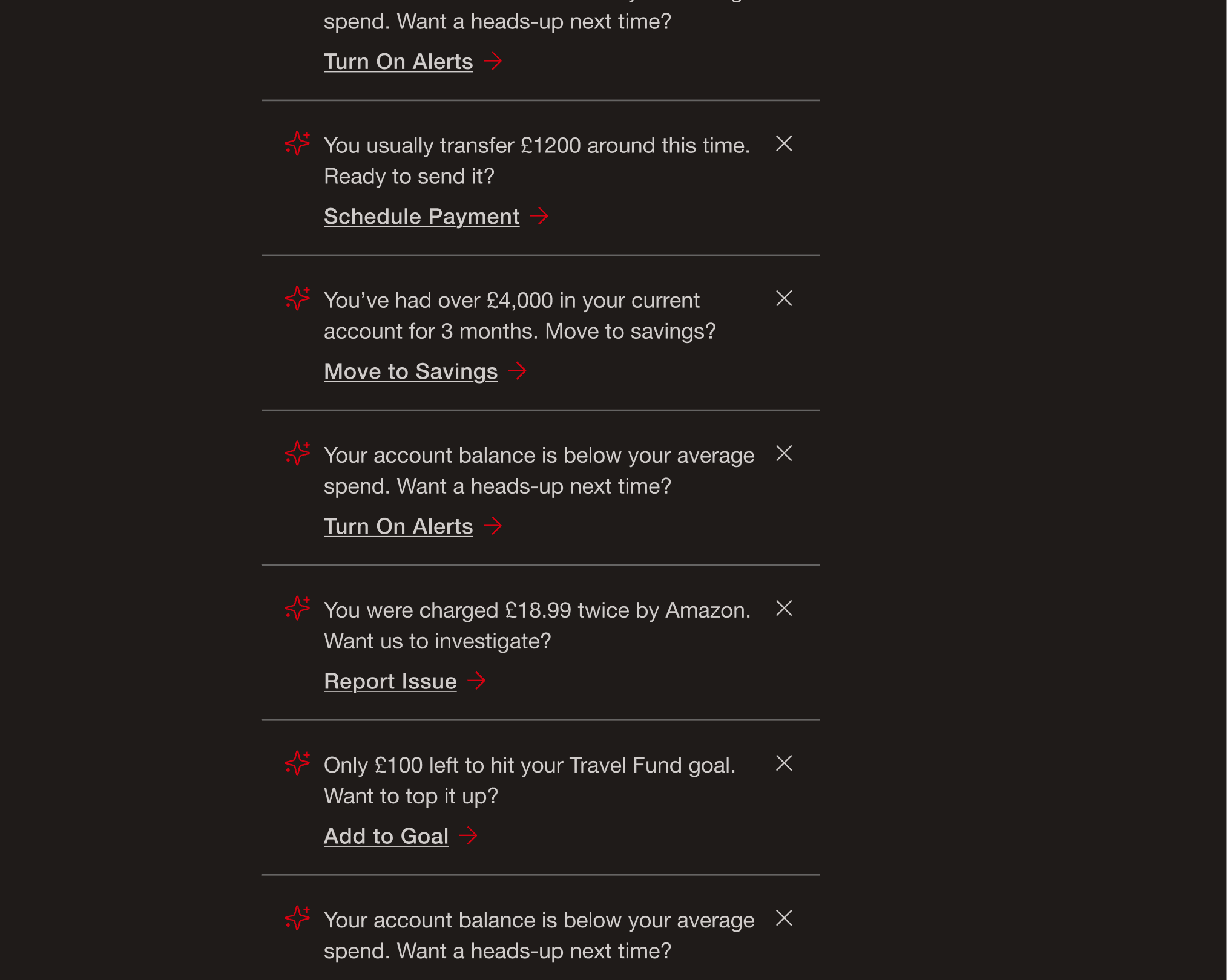
Contextually aware suggestions
Contextually aware suggestions:
Good design is Innovative
People don’t open banking apps to explore; they come with a task in mind. And what if the app could anticipate those needs? By analysing behaviour patterns and transaction history, it can surface the most likely next action. These suggestions aren’t loud or interruptive. They quietly support the task at hand, showing up only when they’re truly useful. All of this is opt in, with clear privacy controls, so customers decide what the app can and cannot use.
People don’t open banking apps to explore; they come with a task in mind. And what if the app could anticipate those needs? By analysing behaviour patterns and transaction history, it can surface the most likely next action. These suggestions aren’t loud or interruptive. They quietly support the task at hand, showing up only when they’re truly useful. All of this is opt in, with clear privacy controls, so customers decide what the app can and cannot use.
Hypothesis: Fewer taps to complete common tasks
Hypothesis: Fewer taps to complete common tasks
02:
02: Good design is Useful
02: Good design is Useful
Search that
actually helps
Search that actually helps
Search that actually helps:
Good design is Useful
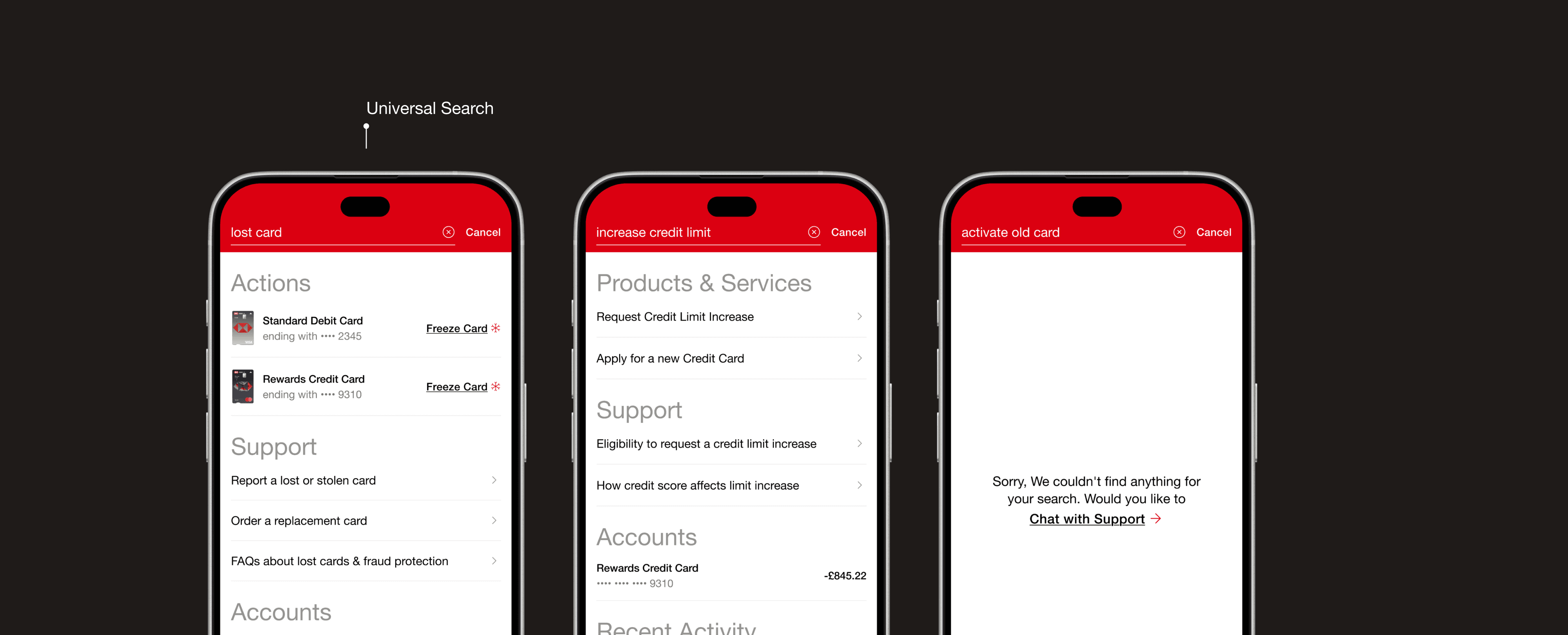
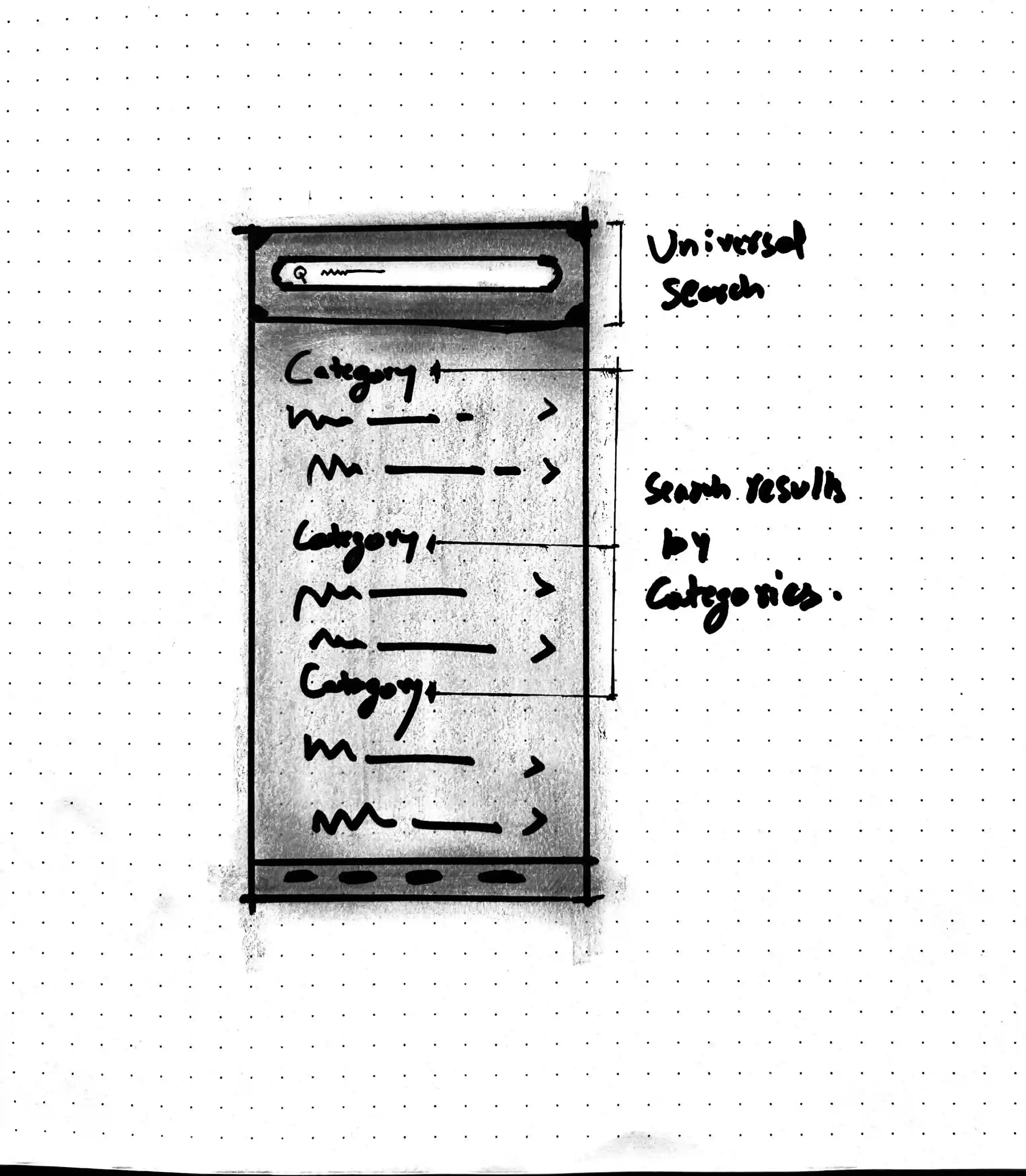
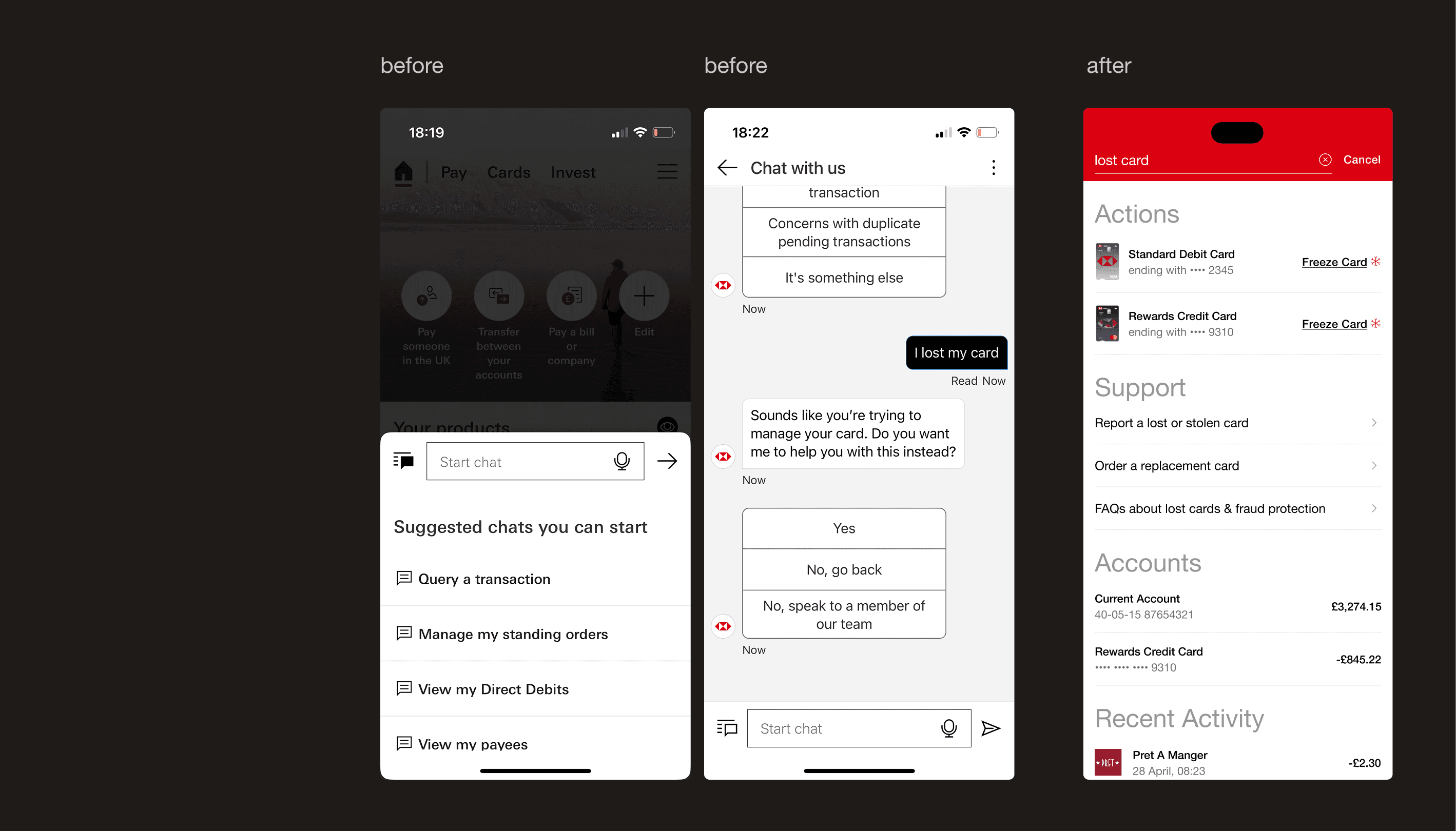
Surprisingly, the app lacks a proper search. It’s fragmented, buried in transactions or hidden in FAQs. I prototyped a Universal Search that works across everything: actions, payments, support, and settings. It’s fast, intuitive, and exactly where you expect it.
Surprisingly, the app lacks a proper search. It’s fragmented, buried in transactions or hidden in FAQs. I prototyped a Universal Search that works across everything: actions, payments, support, and settings. It’s fast, intuitive, and exactly where you expect it.
Hypothesis: Reduces reliance on menus and "chat to an agent" requests by keeping core tasks searchable.
Hypothesis: Reduces reliance on menus and "chat to an agent" requests by keeping core tasks searchable.
03:
03: Good design is Aesthetic
03: Good design is Aesthetic
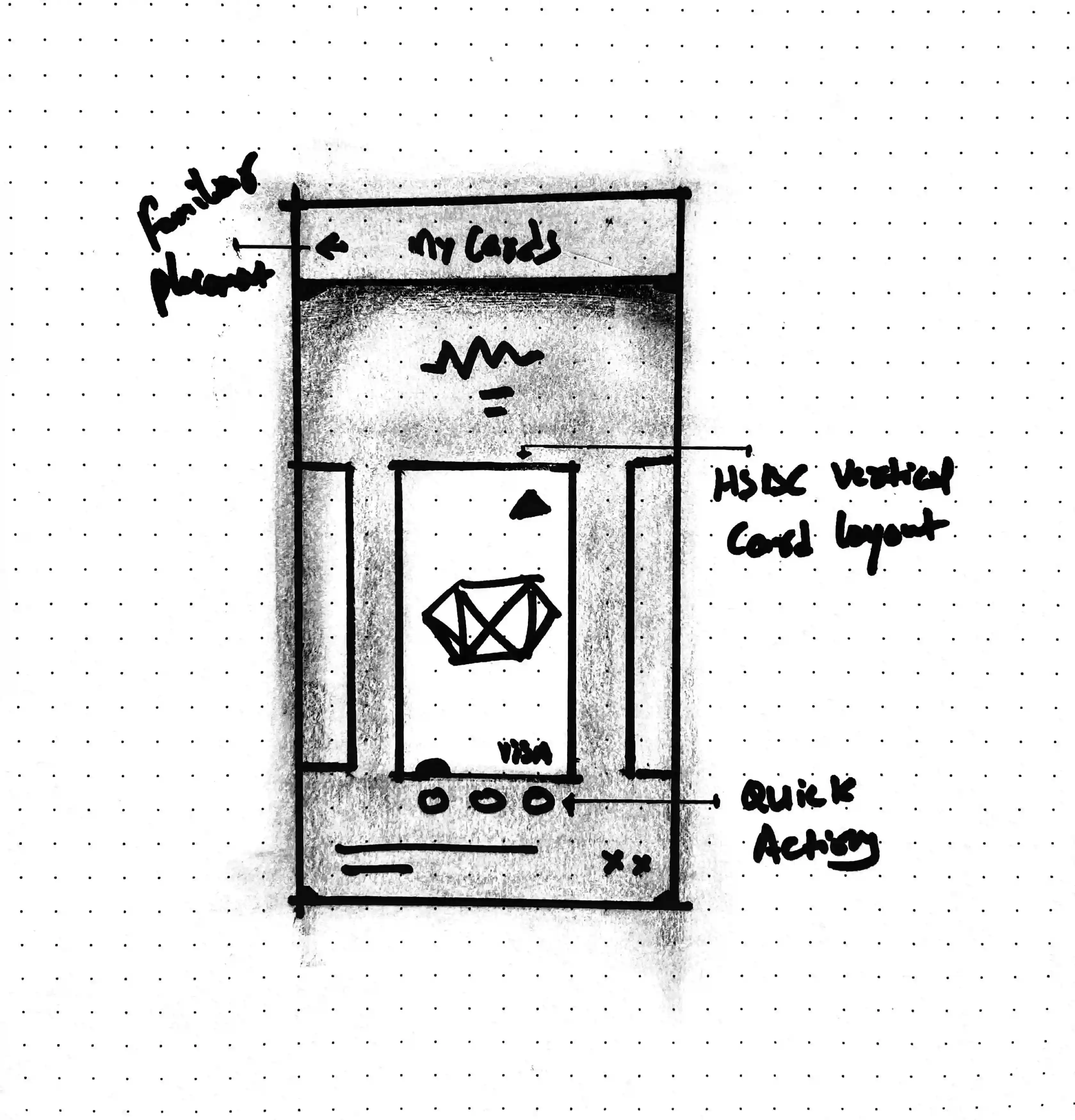
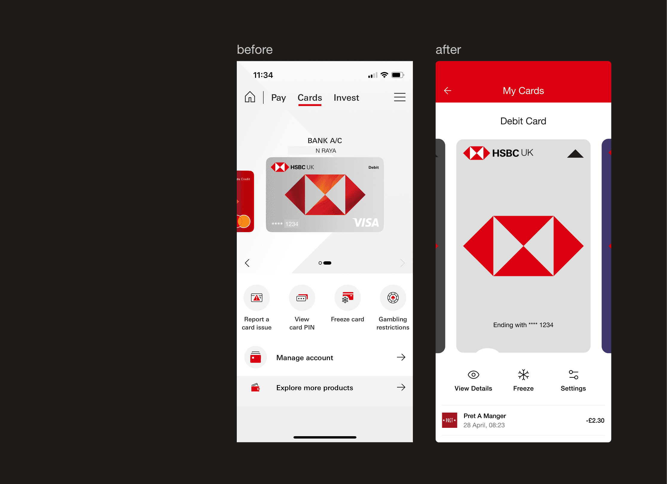
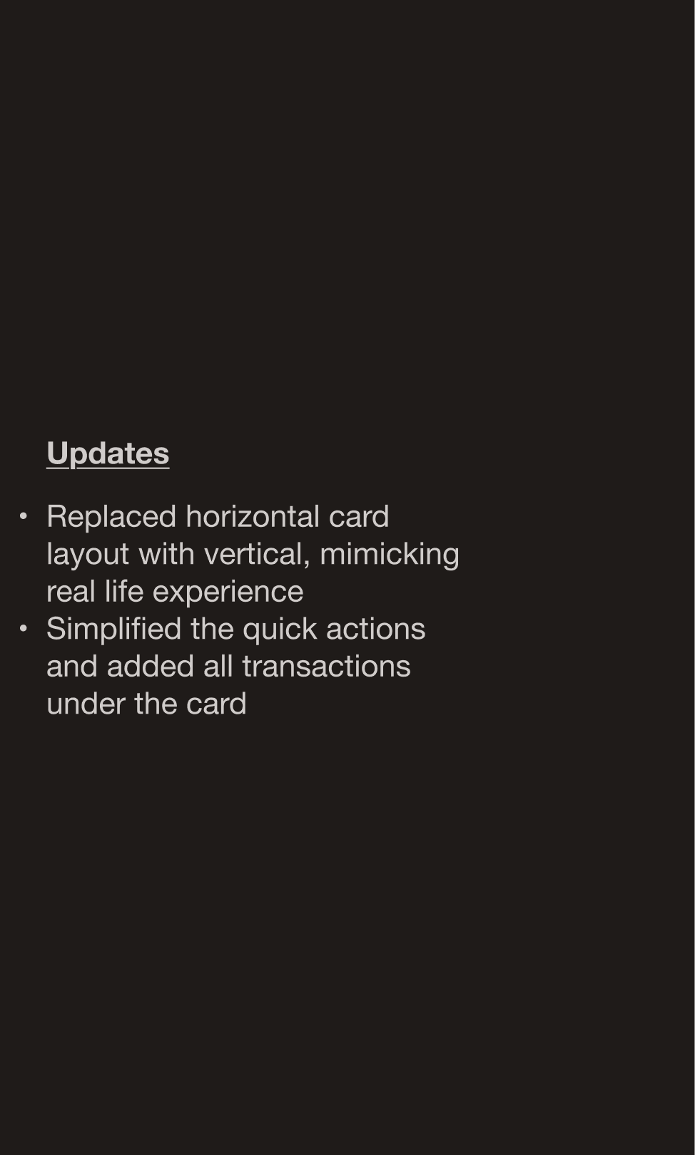
Form follows function
Form follows function
Good design is Aesthetic
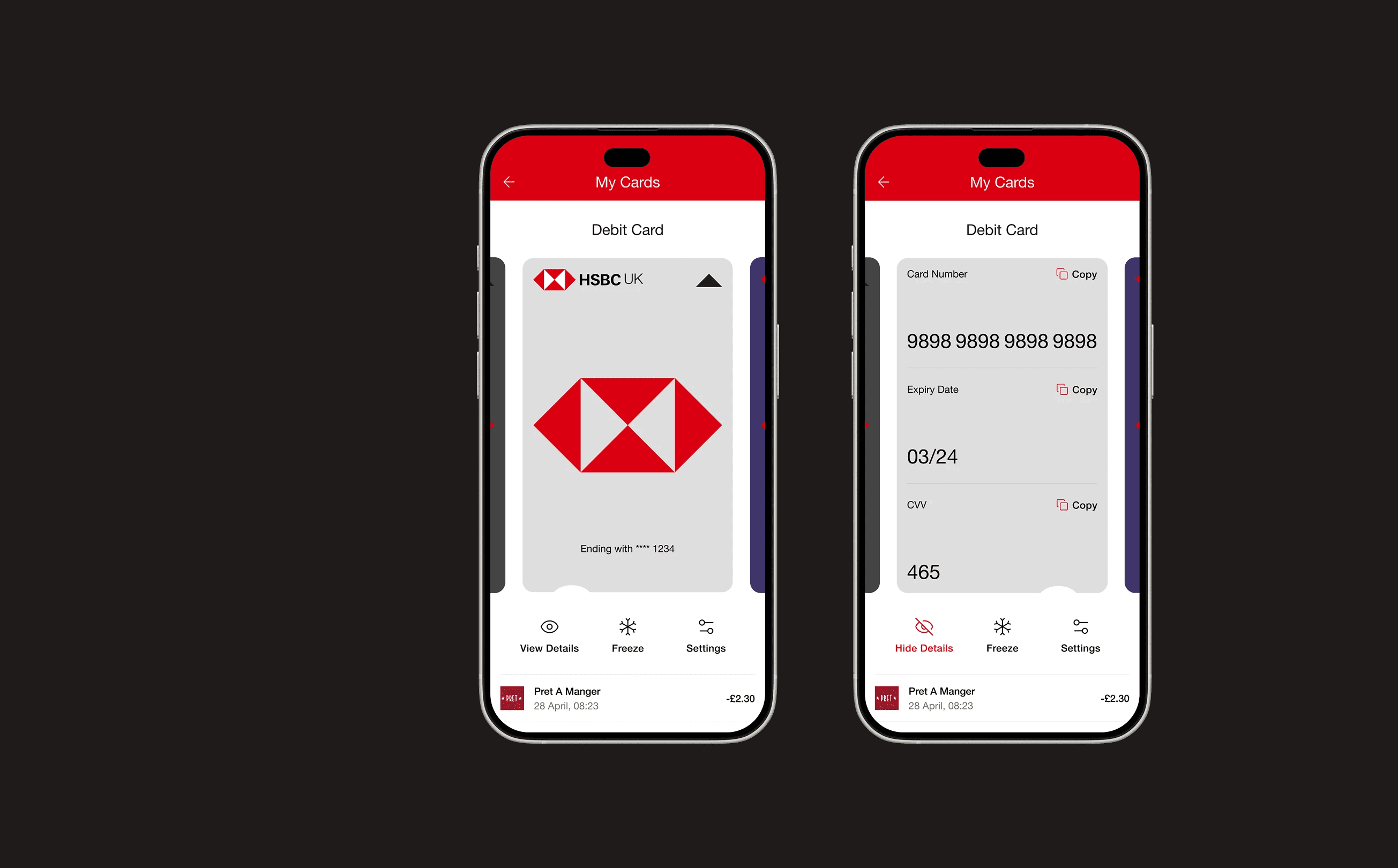
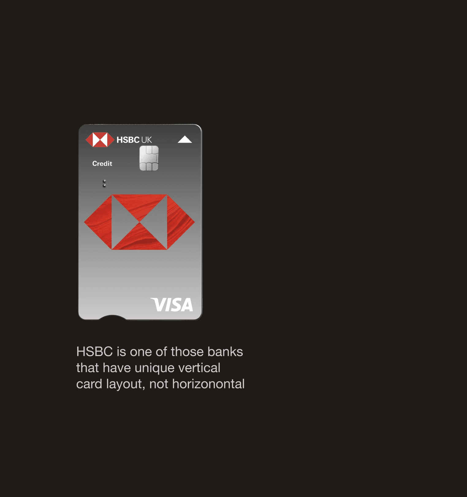
Design isn’t decoration; it’s communication. In this concept I focused on mirroring physical reality: the digital card now matches the vertical HSBC card customers carry in their wallet and the way they hold their phone.
Design isn’t decoration; it’s communication. In this concept I focused on mirroring physical reality: the digital card now matches the vertical HSBC card customers carry in their wallet and the way they hold their phone.
Hypothesis: Strengthens brand consistency across physical and digital touchpoints.
Hypothesis: Strengthens brand consistency across physical and digital touchpoints.
04:
04: Good design is Understandable
04: Good design is Understandable
Clarity builds confidence
Clarity builds confidence
Good design is Understandable
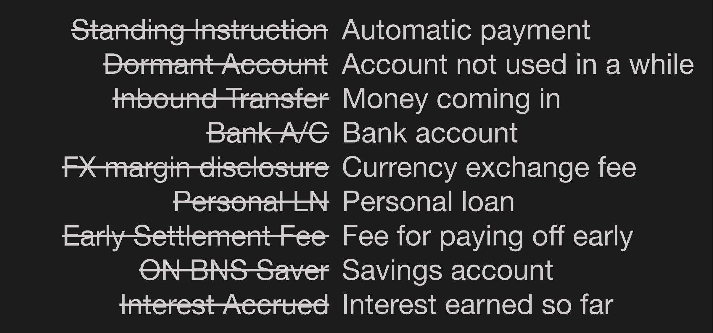
Money is already stressful, and language like “FX margin disclosure” or “standing instruction mandate” only makes it worse. In this concept, I rewrote key terms in plain, everyday language so people can understand what’s happening without feeling talked down to.
Money is already stressful, and language like “FX margin disclosure” or “standing instruction mandate” only makes it worse. In this concept, I rewrote key terms in plain, everyday language so people can understand what’s happening without feeling talked down to.
Hypothesis: When people understand what they’re reading, they’re more likely to complete actions and trust the product they’re using.
Hypothesis: When people understand what they’re reading, they’re more likely to complete actions and trust the product they’re using.
05:
05: Good design is Unobtrusive
05: Good design is Aesthetic
One size
doesn't fit all
One Size Doesn't Fit All
One Size Doesn't Fit All
Good design is Unobtrusive
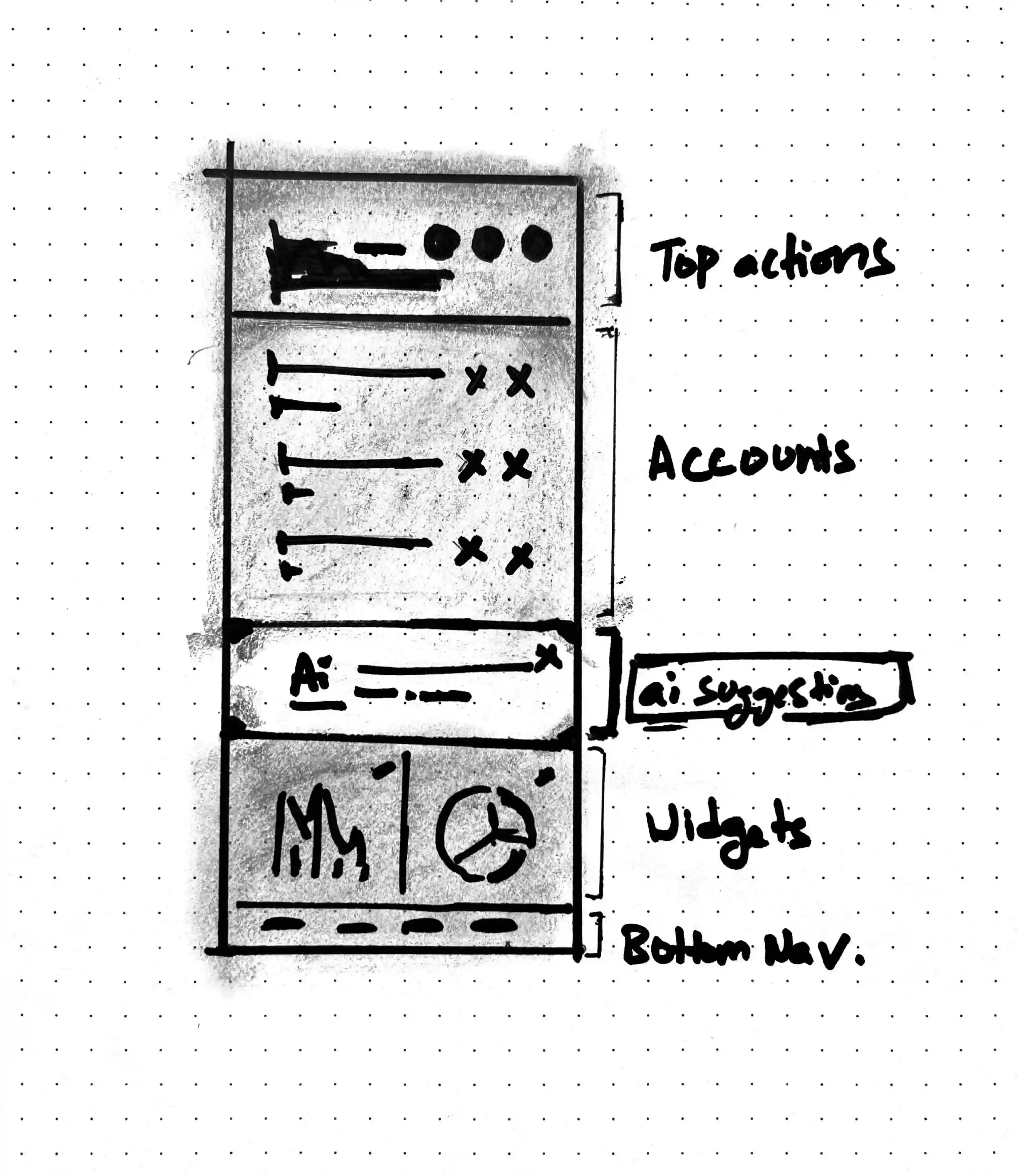
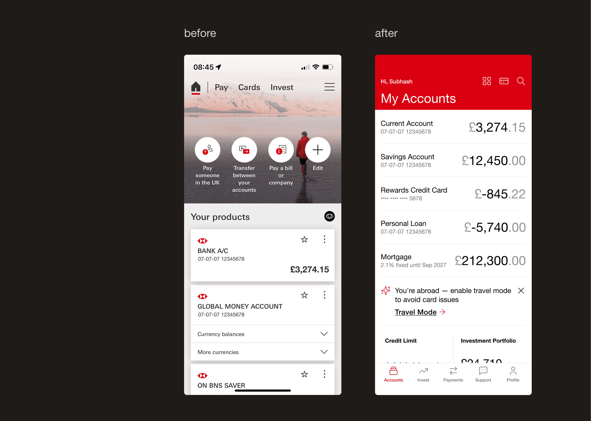
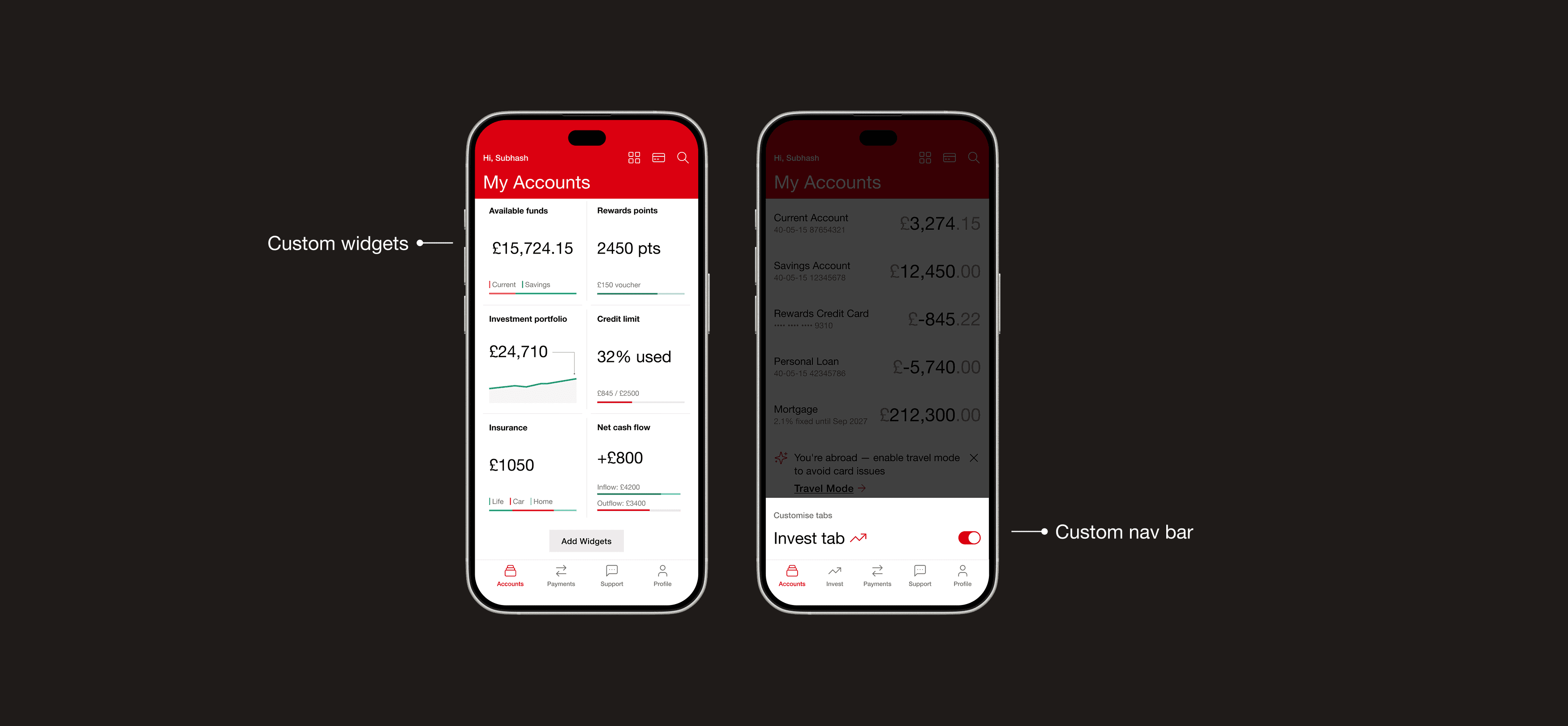
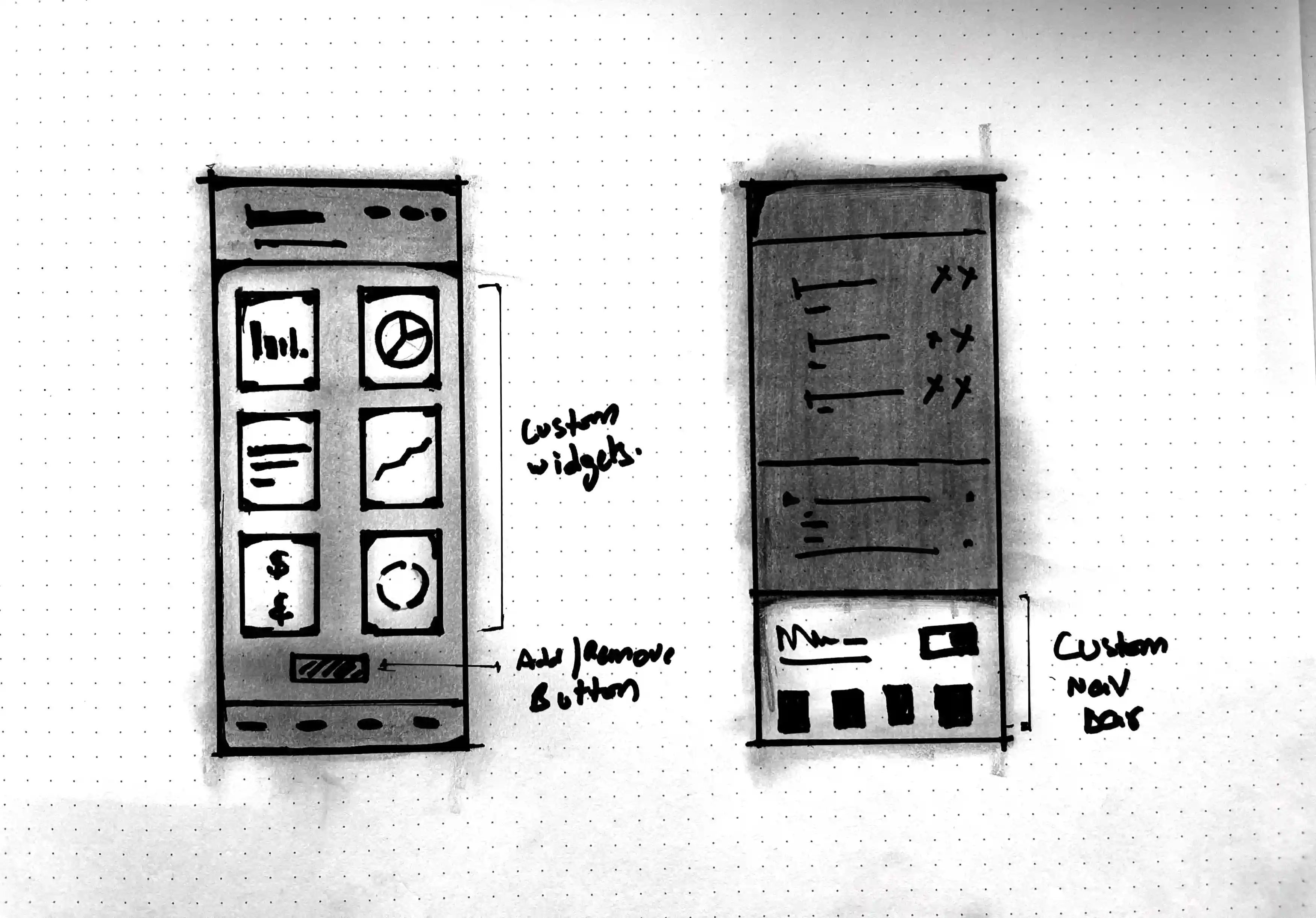
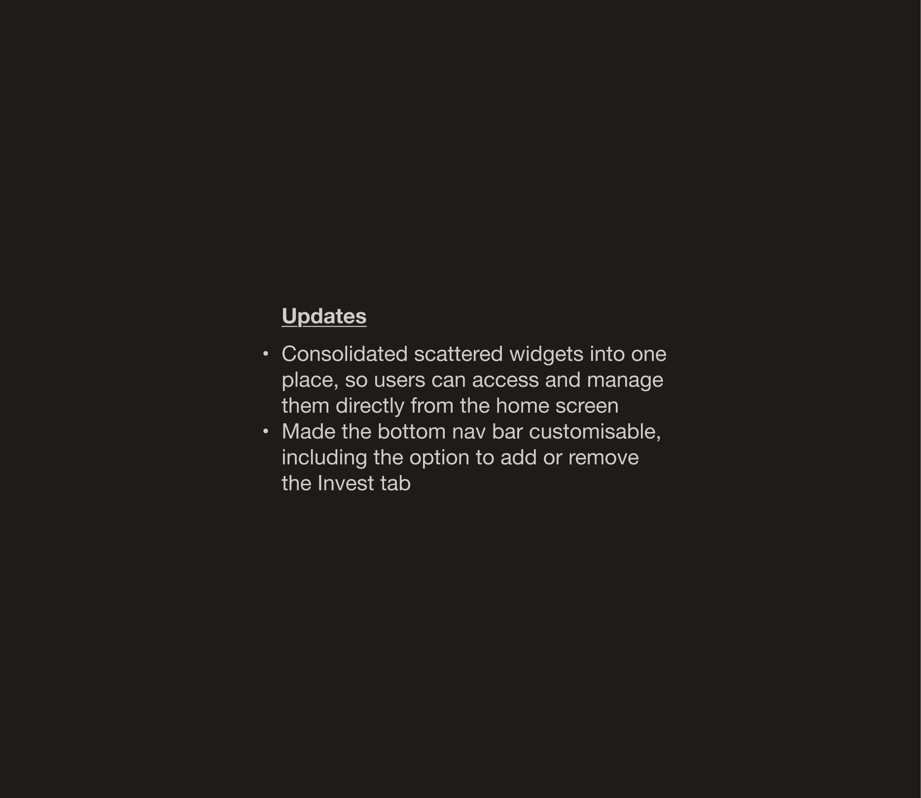
Not every user needs the same tools, all the time. The current app forces every user into the same rigid layout; whether they invest, hold mortgages, or just check their balance. I redesigned the home screen with custom widgets and a flexible nav bar, so the app feels more personal, and less prescriptive.
Hypothesis: Custom widgets give more control to pro users without forcing complexity on everyone else.
Hypothesis: Custom widgets give more control to pro users without forcing complexity on everyone else.
06:
06: Good design is Understandable
06: Good design is Understandable
No hidden catches
No hidden catches
Good design is Honest
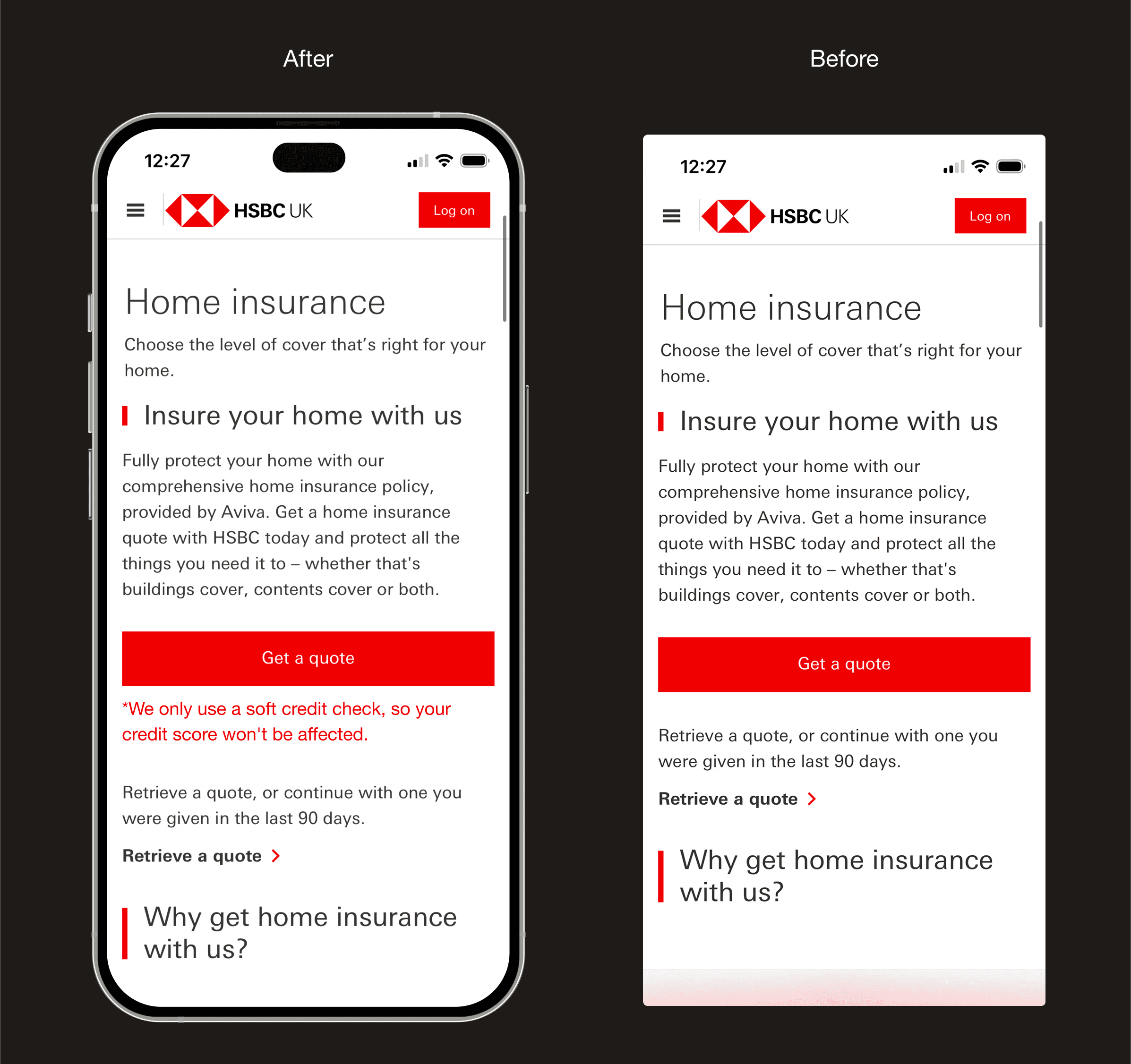
The HSBC insurance page shows a big “Get a quote” button, but no clarity on how it will impact credit scores. Without context, “Get a quote” feels uncertain. A simple note on credit impact makes the process honest and reassuring.
The HSBC insurance page shows a big “Get a quote” button, but no clarity on how it will impact credit scores. Without context, “Get a quote” feels uncertain. A simple note on credit impact makes the process honest and reassuring.
Hypothesis: Being transparent upfront reassures people and fosters a sense of safeness before taking actions.
Hypothesis: Being transparent upfront reassures people and fosters a sense of safeness before taking actions.
07:
07: Good design is Long lasting
07: Good design is Long lasting
Navigation that
can scale
One Size Doesn't Fit All
One Size Doesn't Fit All
Good design is Long lasting
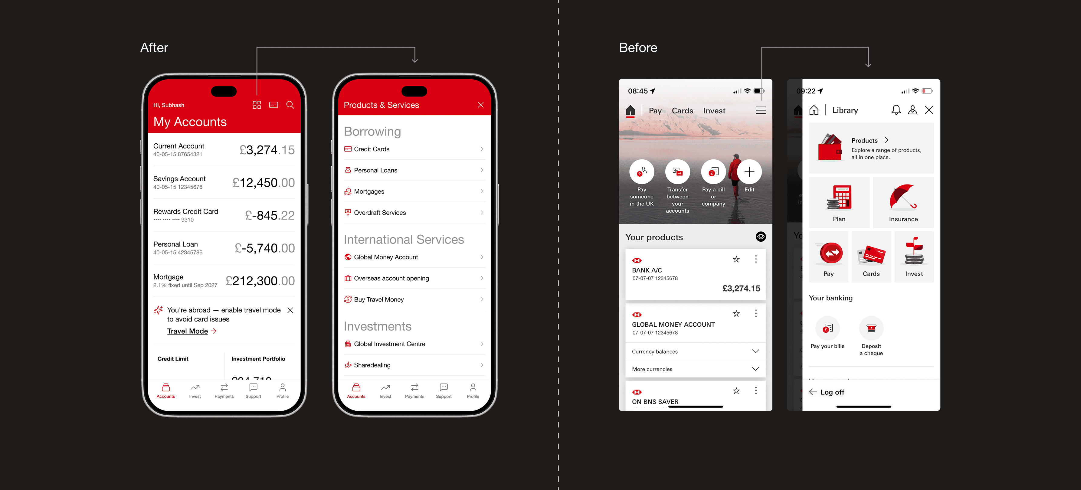
The current app clutters the home screen with static shortcuts for every HSBC product, even if you never use them. I moved them into an expandable menu; accessible when needed, invisible when not.
The current app clutters the home screen with static shortcuts for every HSBC product, even if you never use them. I moved them into an expandable menu; accessible when needed, invisible when not.
Hypothesis: A future-proof structure that keeps the interface clean as services grow, without compromising today’s usability.
Hypothesis: A future-proof structure that keeps the interface clean as services grow, without compromising today’s usability.
08:
08: Good design is Through to the last detail
08: Good design is Through to the last detail
Deeper insights in every transaction
Deeper insights in every transaction
Good design is Through to the last detail
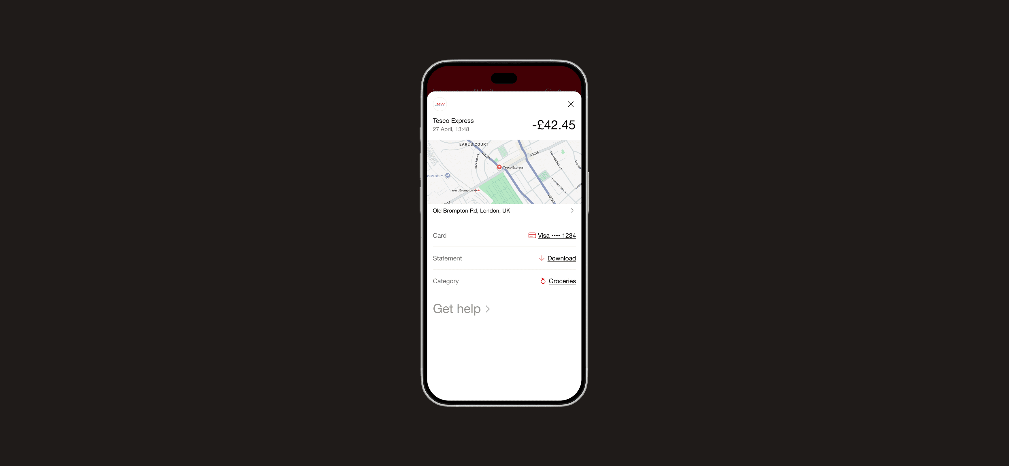
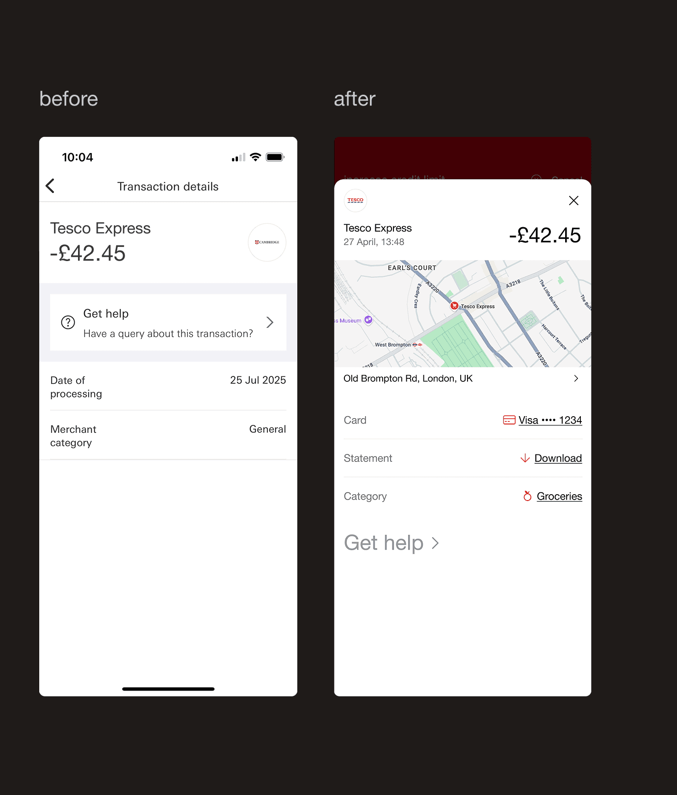
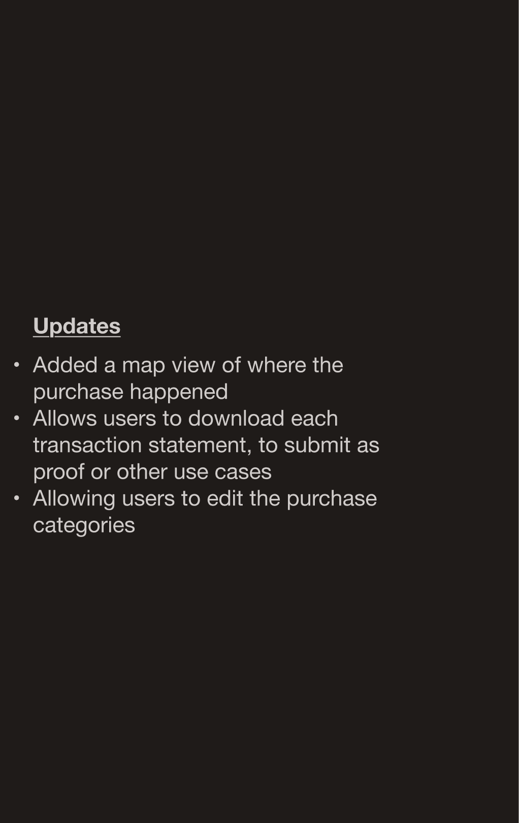
Not recognising a card payment is one of the main reasons people call their bank. In this concept, the transaction detail view adds a map of where the purchase happened, a clear merchant logo, and a simple category tag.
Not recognising a card payment is one of the main reasons people call their bank. In this concept, the transaction detail view adds a map of where the purchase happened, a clear merchant logo, and a simple category tag.
Hypothesis: Reduces “I don’t recognise this” calls by making each payment easier to recall at a glance.
Hypothesis: Reduces “I don’t recognise this” calls by making each payment easier to recall at a glance.
09:
09: Good design is Understandable
09: Good design is Understandable
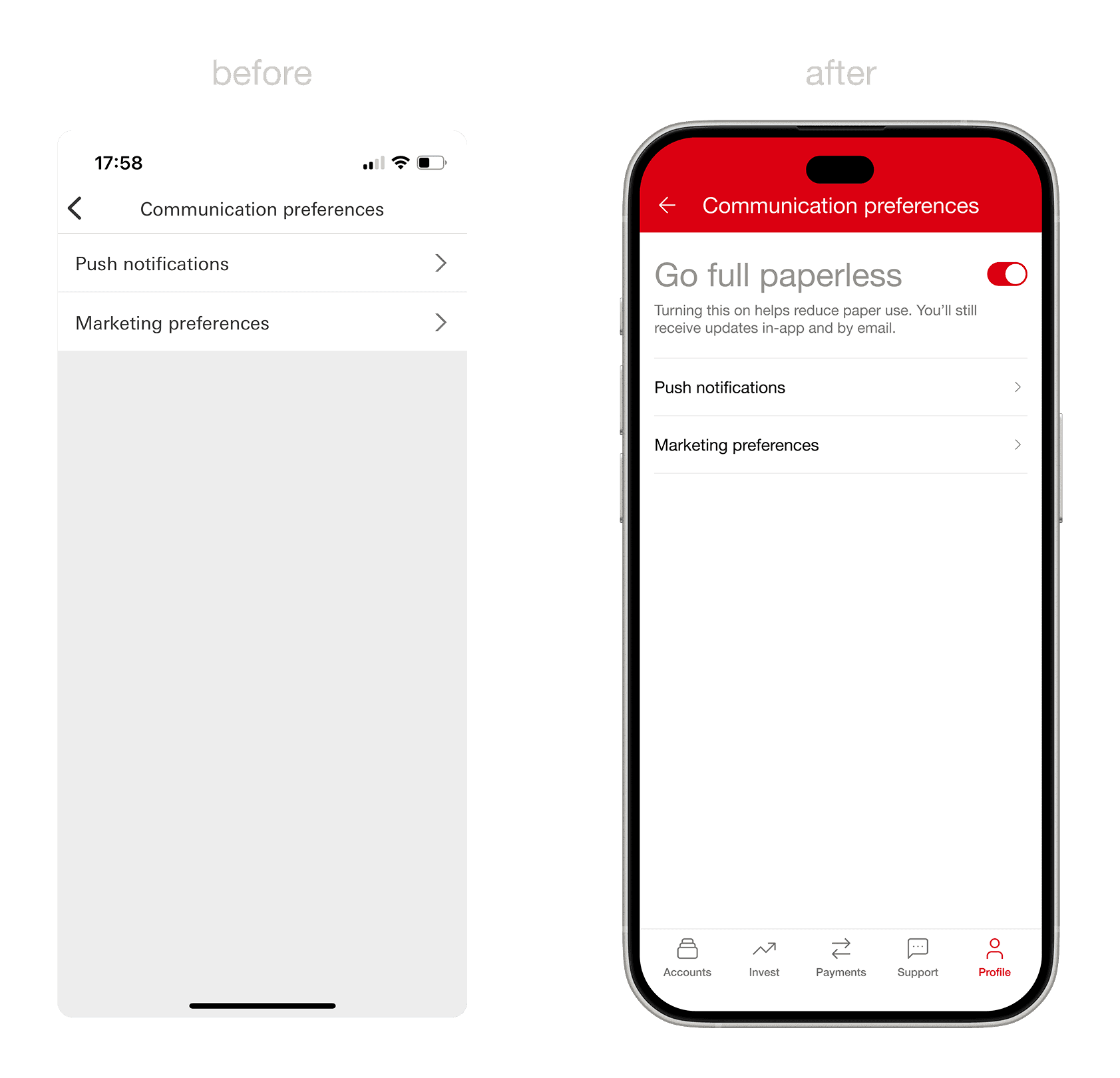
Going full paperless
Going full paperless:
Good design is Environmentally friendly
There’s no clear way to stop paper mail in the current app; users still receive printed statements by default. I added a simple “Go full paperless” toggle in communication preferences.
There’s no clear way to stop paper mail in the current app; users still receive printed statements by default. I added a simple “Go full paperless” toggle in communication preferences.
Hypothesis: A quick win for the user and the planet; cutting down waste while reducing operational costs for the business.
Hypothesis: A quick win for the user and the planet; cutting down waste while reducing operational costs for the business.
10:
10: Good design is As little design as possible
10: Good design is Aesthetic
Less is more
One Size Doesn't Fit All
Good design is As little design as possible
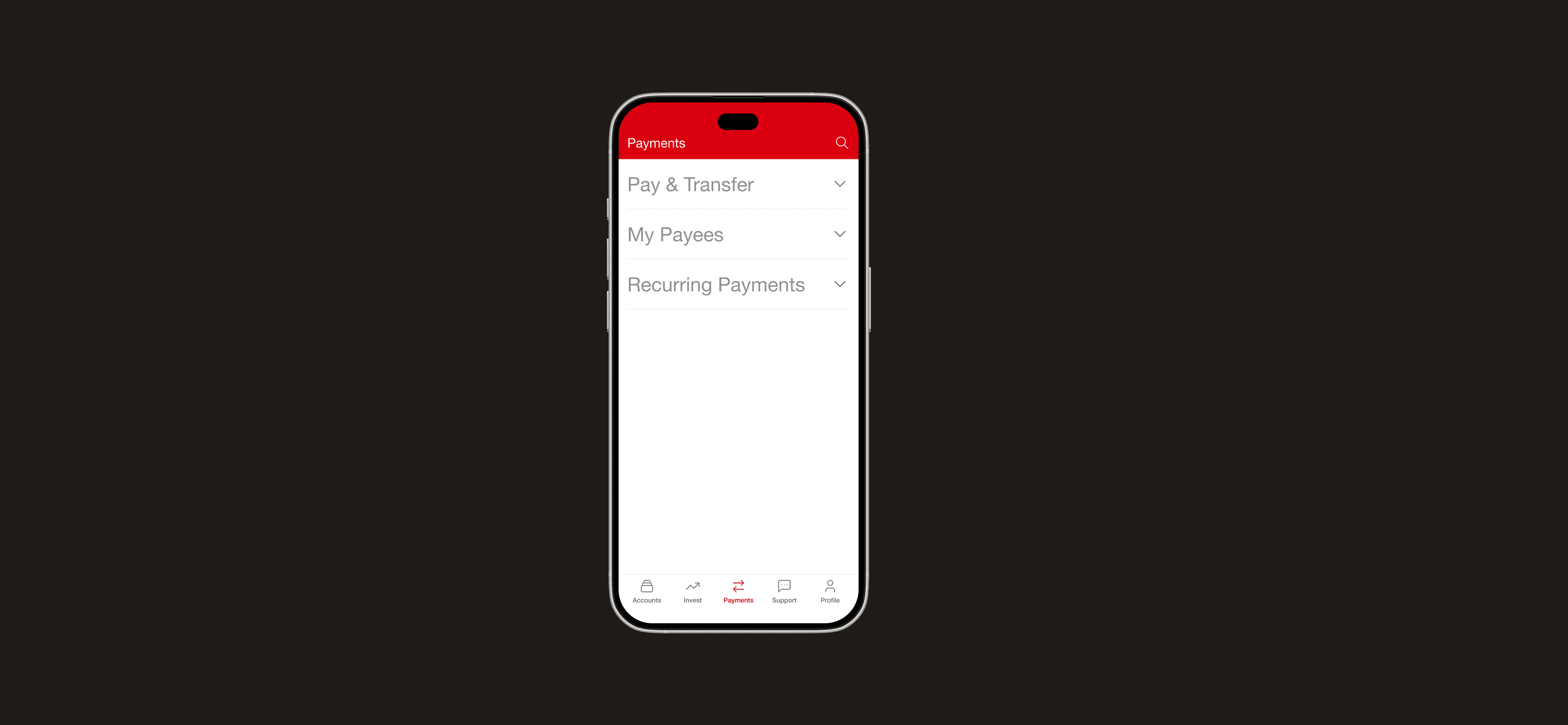
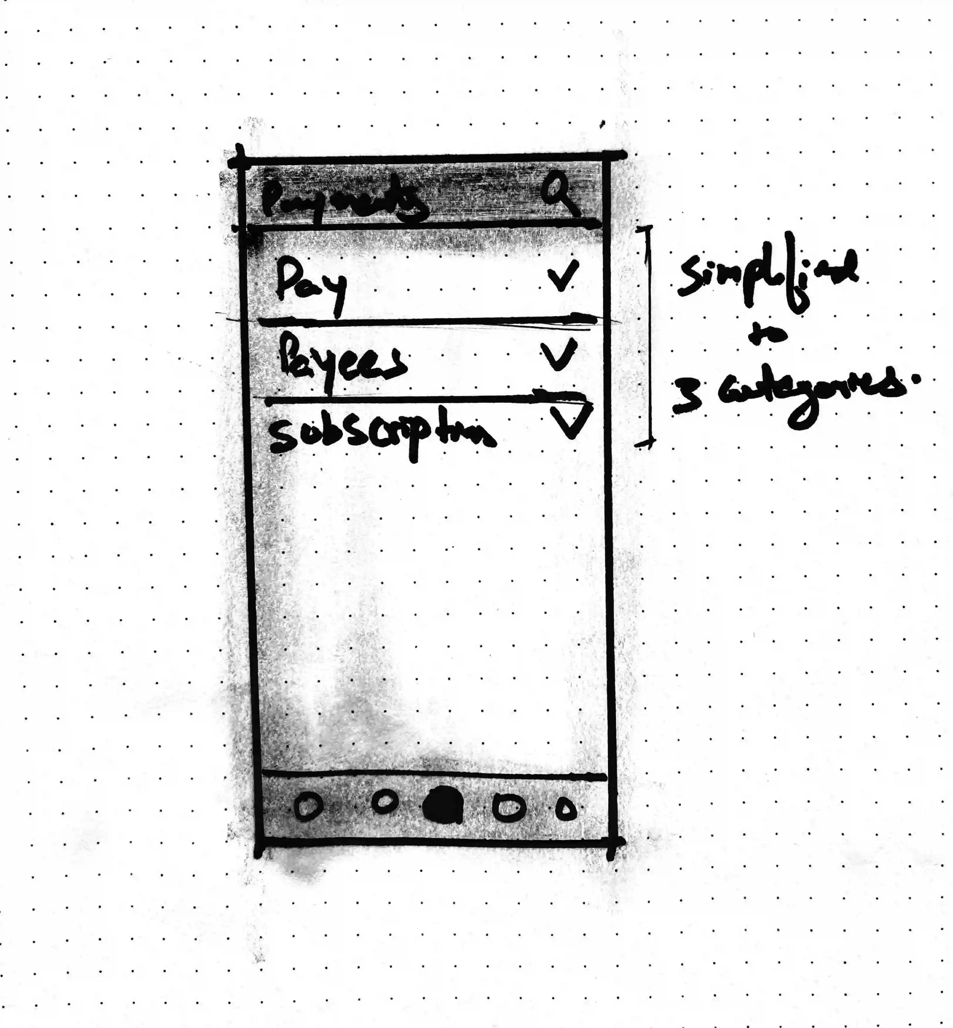
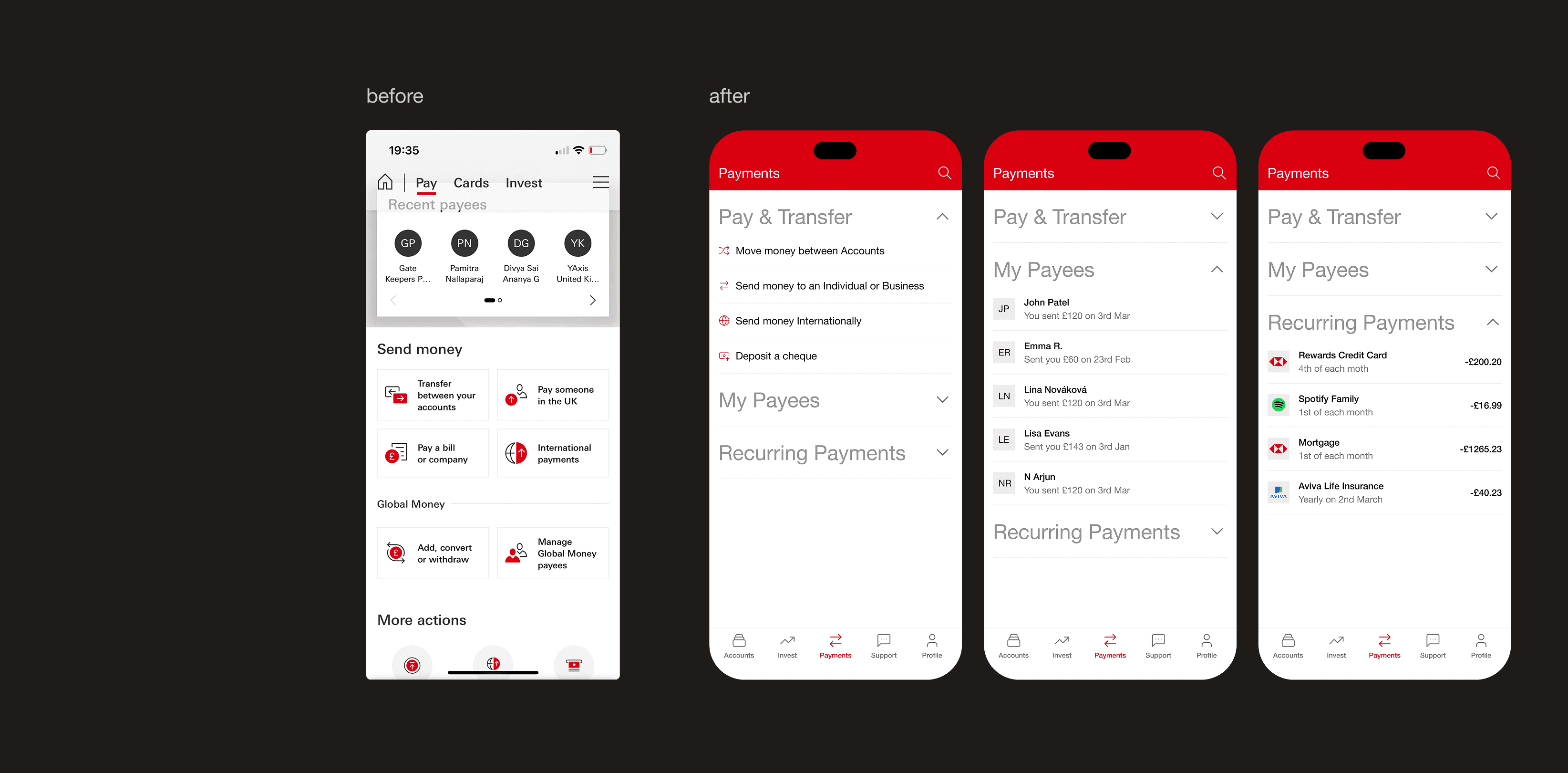
The payments screen tries to do too much at once; cramming in options that distract rather than help. I simplified it into three clear sections: Pay & Transfers, Payees, and Recurring Payments. With progressive disclosure, details appear only when needed.
The payments screen tries to do too much at once; cramming in options that distract rather than help. I simplified it into three clear sections: Pay & Transfers, Payees, and Recurring Payments. With progressive disclosure, details appear only when needed.
Hypothesis: Simplifying complex flows leads to faster task completion and fewer errors in high-stakes moments like sending money.
Hypothesis: Simplifying complex flows leads to faster task completion and fewer errors in high-stakes moments like sending money.